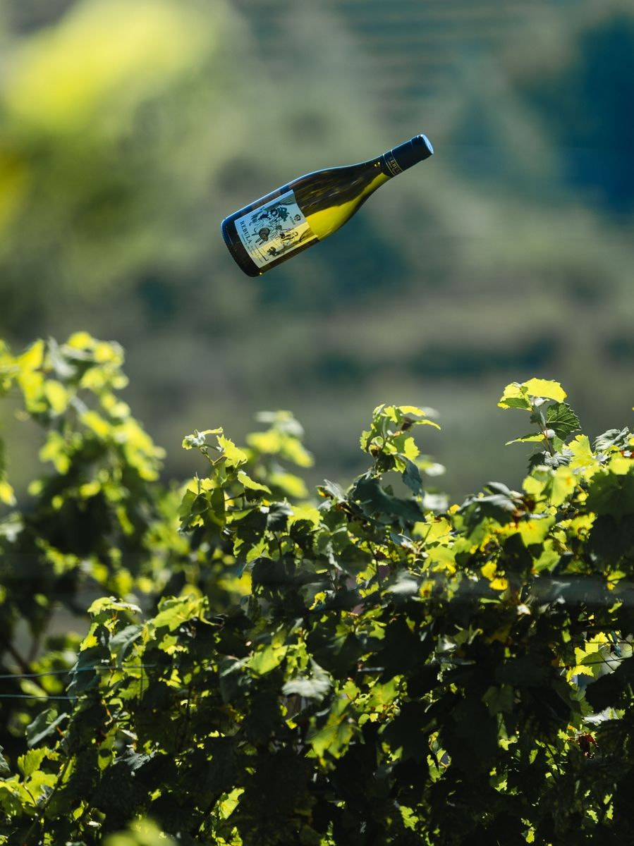
Label as a wine Storytelling

Wine labels have a long history dating back to the 18th century when winemakers began labeling their wines with handwritten tags. Over time, labels have become more sophisticated, especially with the introduction of printing technology and artistic approaches in design. Today, wine labels are a true artistic expression and an important marketing tool. In this blog, we will explore how illustrations contribute to the design of wine labels, what they convey, and how they influence the perception of wine.
When we walk through the wine section of a store, we are often first attracted by the colorful and appealing wine labels. Medot's still wine labels are characterized by illustrations. Their purpose is not just visual appeal, but they also bring a story, history, and soul of the wine.
It must be emphasized from the outset that labels also carry a lot of important information that helps us choose the right wine, such as the name of the winemaker or vineyard, vintage, region, alcohol content, sometimes even grape variety, certifications, and awards. Part of the information on the label is regulated by law and varies by country, with particularly strict frameworks in old world countries. For example, French, Italian, and German wines have precisely prescribed ways of labeling winemakers, vineyards, regions, grape quality, and so on, with a rich tradition and worldwide fame, making this information the only and entirely sufficient marketing message. In this blog, we focus on those wine labels where aesthetics and marketing play a key role in identification, as attractive labels capture attention, stand out on the shelf, and attract buyers looking for something special. Above all, labels comprehensively showcase the winemaker's philosophy. For Medot, as with our wine, it is crucial that everything is in balance, our guiding principle is harmony and elegance.
The Process of Creating Illustrations for Wine Labels
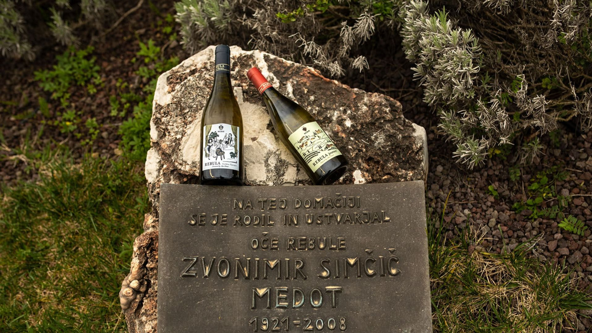
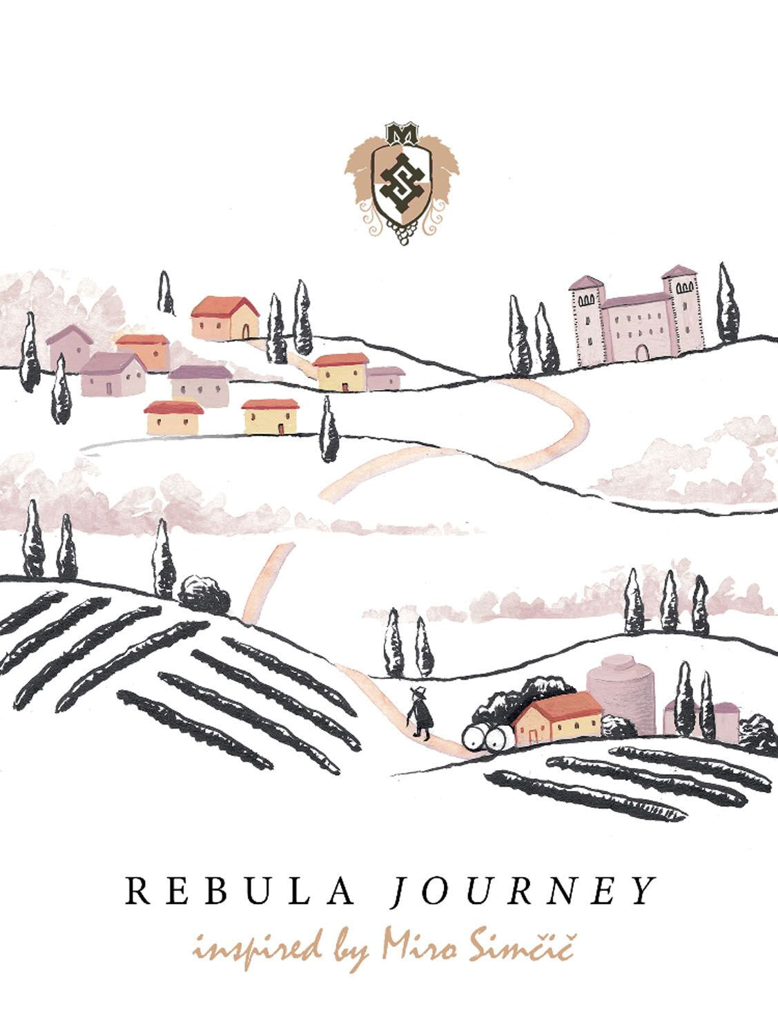
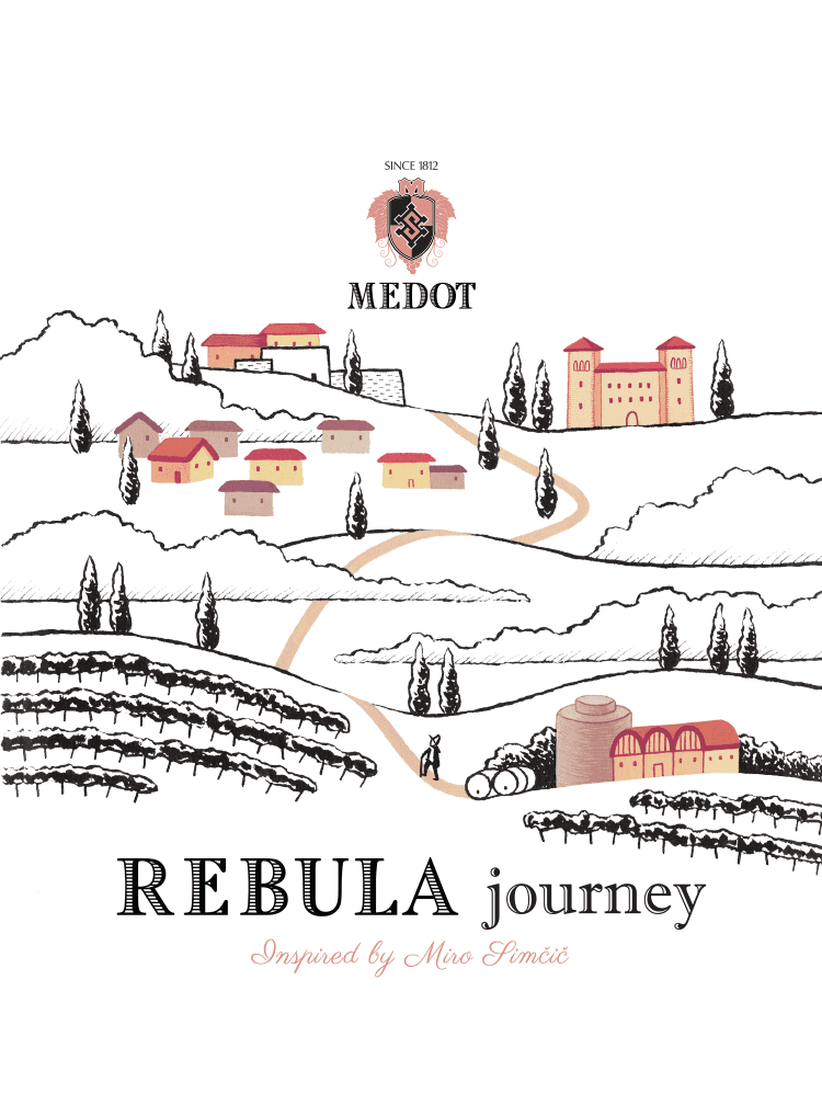
Illustrations are an excellent choice if we focus on reflecting the tradition of the vineyard, the region, and the influence of historical figures who are no longer with us. The founder of Medot was the Father of Rebula, and it is to him that the still wines of Rebula are dedicated, so the illustration was the only logical choice, creating a sense of connection with Medot's heritage. When we at Medot decided on an illustrated label, we did not yet know that we were embarking on such a special and interesting adventure to realize an idea that would tell our wine story on the label. Of course, we started from the very beginning.
Choosing the Artist
We sought out the central institution in the field of illustration in Slovenia, Center ilustracije (the Illustration Center), which operates at Vodnik Homestead in Ljubljana, where the head Maša P. Žmitek helped us conduct an idea competition among the members. After receiving some extremely interesting and diverse proposals, we chose the sketch created by the illustrator Liana Saje Wang. If we were to briefly summarize what tipped the scales in the selection, we would say it was the touch of romance in the presentation of the story.

Understanding the Wine and the Winemaker
Before the artist begins creating the illustration, they must get to know the winemaker's story, the brand's philosophy, and also understand the character of the wine - whether the wine is bold and strong, light and fresh, or complex and mature. Collaboration between the artist and the winemaker is crucial, as only a comprehensive understanding of the story, philosophy, and wine allows the artist to create an authentic and coherent illustration and helps shape an appropriate visual story. At Medot, through collaboration with Liana, we built a close bond and found a common vision for our labels.
Choosing Styles and Techniques
Who better to explain this than the artist herself: “The character of the drawing is created by the thoughtful choice of painting medium and the use of various painting techniques. Stylization and diverse use of medium and techniques infuse each illustration with its own visual note, rhythm, lyricism, or narrative.
Different painting media, such as ink, drawing, print, watercolor, digital illustration, can bring different feelings and messages. For example, watercolors, if desired, can create a sense of softness and elegance, while more refined graphics can emphasize purity and modernity,” explained Liana Saje Wang, adding: “In the search for the right illustration for Rebula Journey, after the selected sketch and concept, the mixed technique of ink and gouache offered itself. The pen drawing with its dramatic contrast on light paper creates a clear narrative and is a very classic technique with a long tradition. The gouache tempera accents, however, bring vibrancy and, in my opinion, a bit of fairy-tale quality in these warm shades of orange and red, as if the houses were illuminated by the evening sunlight...”

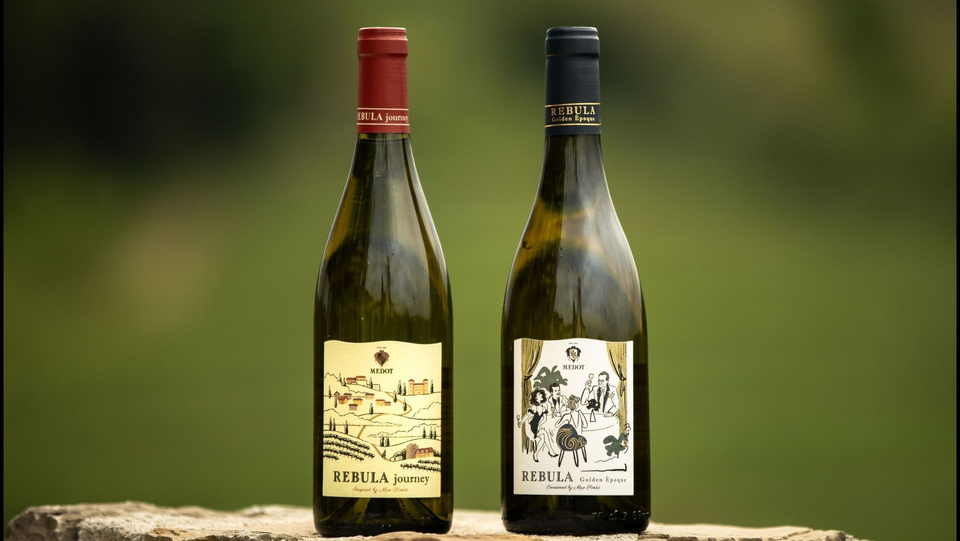
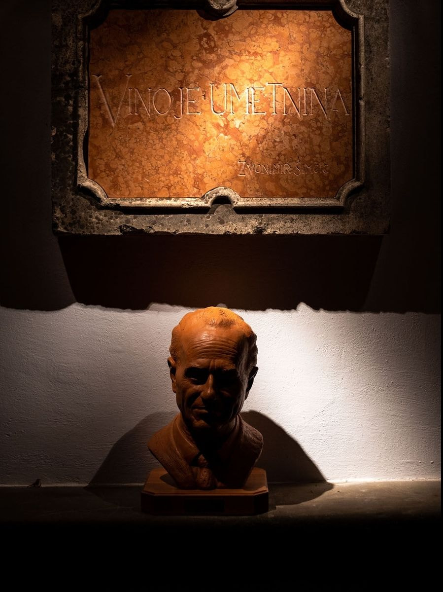
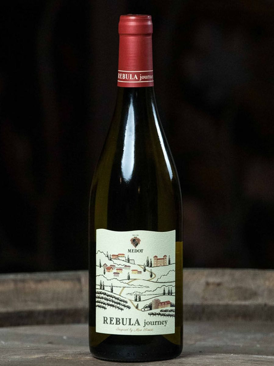
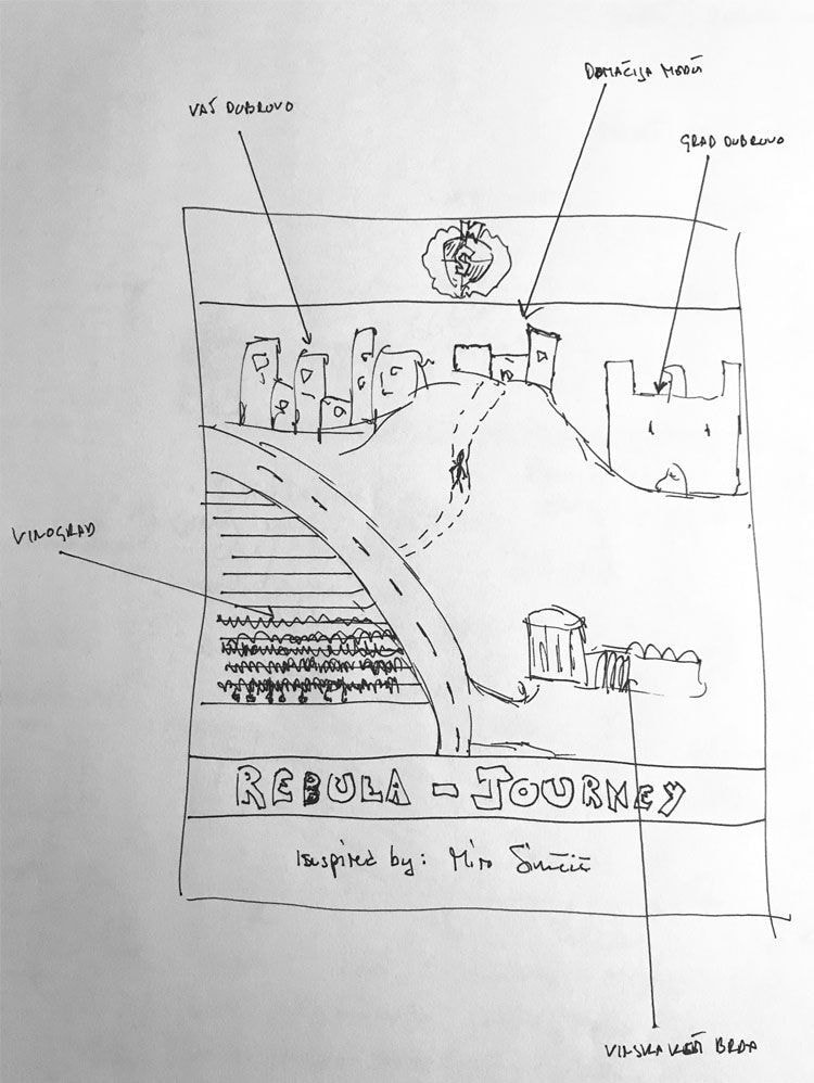
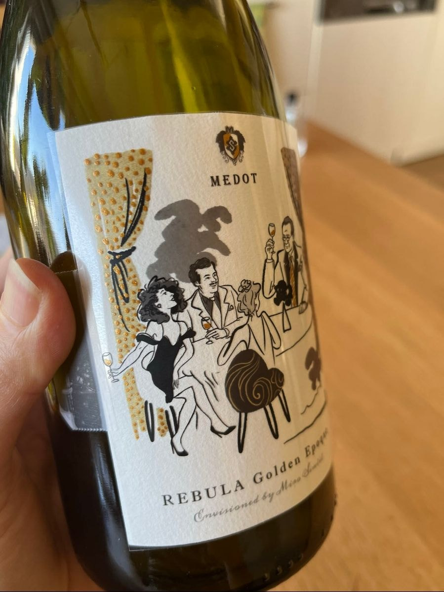
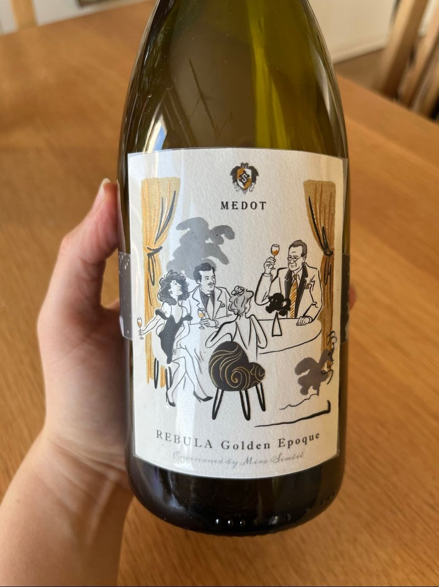
For Medot, the goal was to create pleasant, eye-catching illustrations with a romantic touch that would arouse curiosity about this extraordinary story. The Rebula Journey wine label represents the life journey of Zvonimir Simčič, the Father of Rebula, who is credited with preserving the Rebula variety in Brda and for the international success and golden age of Rebula during his leadership of the cooperative cellar. After retiring, in his golden age, he crowned his fruitful oenological and managerial career when he concentrated all his knowledge and experience in the most daring innovations in his own vineyard and began creating sparkling wines from Rebula based on the classic champagne method, which became a hit. This led to the establishment of the Medot brand, named after the homestead, preserved from the nickname of Zvonimir's father Ciril Metod. This is why in the illustration, you will find the recognizable castle of the hometown in Dobrovo, the illustration of the cooperative cellar as it looked during Zvonimir's time, the typical Brda terraces with Rebula vineyards, and of course, the Medot Estate. The central line connecting all the elements is the road - journey; on it, a keen eye will also notice the figure of an elegant gentleman with a hat, who carefully observes the vineyards and vines on the way between the cellar and his home - this is, of course, the Father of Rebula, Zvonimir Simčič.
The next label was Rebula Golden Époque, whose goal was to evoke Zvonimir's most prolific period. The wine in this bottle was inspired by him, as an interpretation of what we believe he would create today if he wanted to make something truly exceptional.
As the name of the wine suggests, it recreates the atmosphere of the golden times. In modern art, the golden times or Golden Époque is the period in the 1920s, but then still very poor Brda experienced its golden times half a century later, in the 1970s and 1980s, precisely because of the incredible successes with Rebula, produced under the baton of the abroad-educated and internationally respected oenologist Zvonimir Simčič, founder of Medot. Rebula thus became the driving force of Brda's development, paving the way for the creation of a vibrant and highly successful region today, known worldwide as one of the best regions for white wines, while Zvonimir’s contribution to development of Brda region earned him the title of the first honorary citizen of Brda in 2005.
"For the illustration of Rebula Golden Époque, I began studying drawings, paintings, illustrations, and photographs that depicted the lively salon life in Europe in the 1980s. During the study, I discovered as a source of inspiration the excellent illustrator Léon Bonnat (1888-1966), who often depicted the lively life of Parisians, and his illustrations in the art deco style adorned various fashion magazines of that time. Stylistically, I decided to portray the vibrancy of this period, so the lines are very dynamically drawn, in quick and bold strokes, carrying a lot of life and almost moving, as the joy around the depicted table is in motion, enjoying this golden time. The lively lines and the flat choice of color surfaces are also a continuity of the illustration as a continuation of Rebula Journey," said Liana Saje Wang.
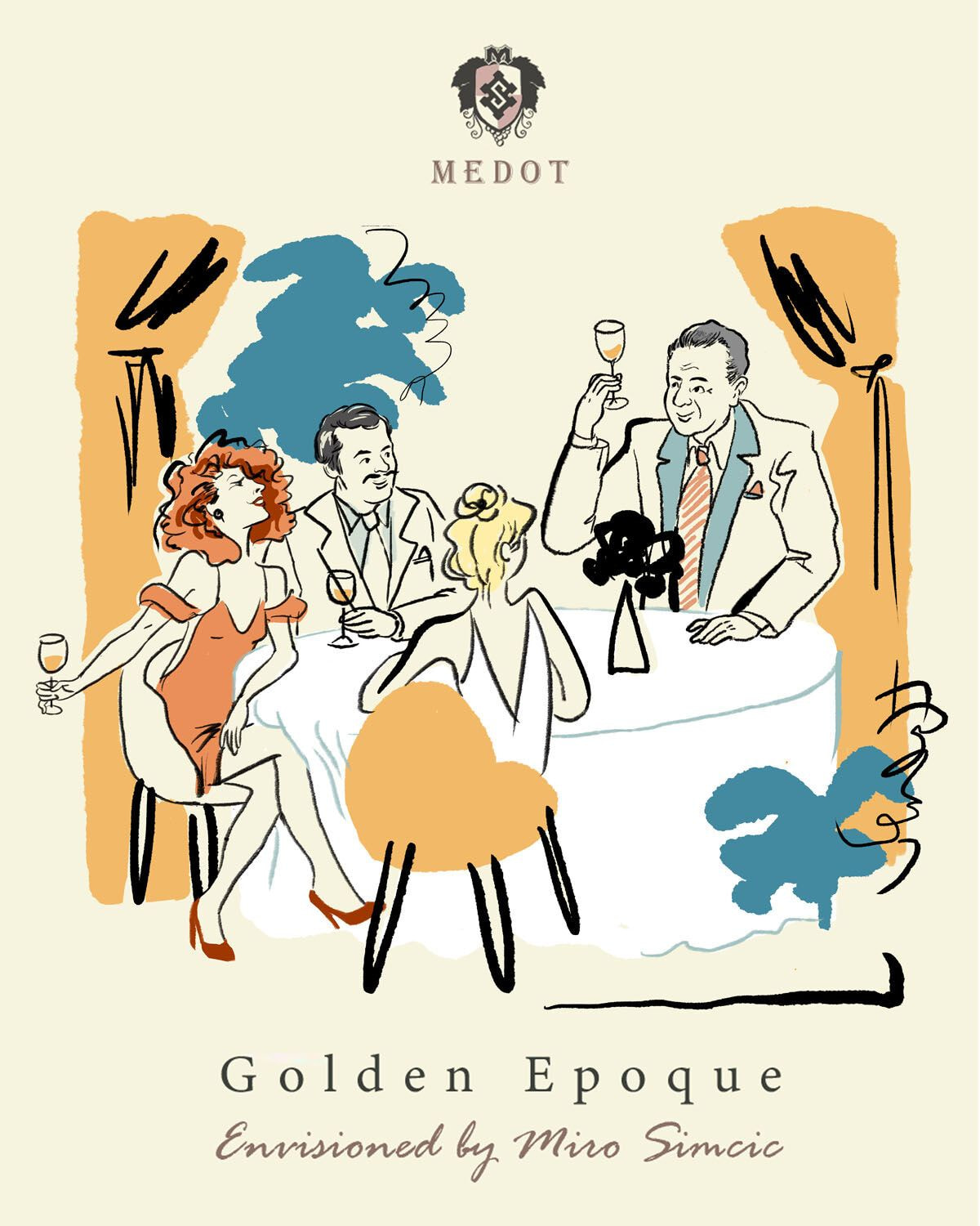
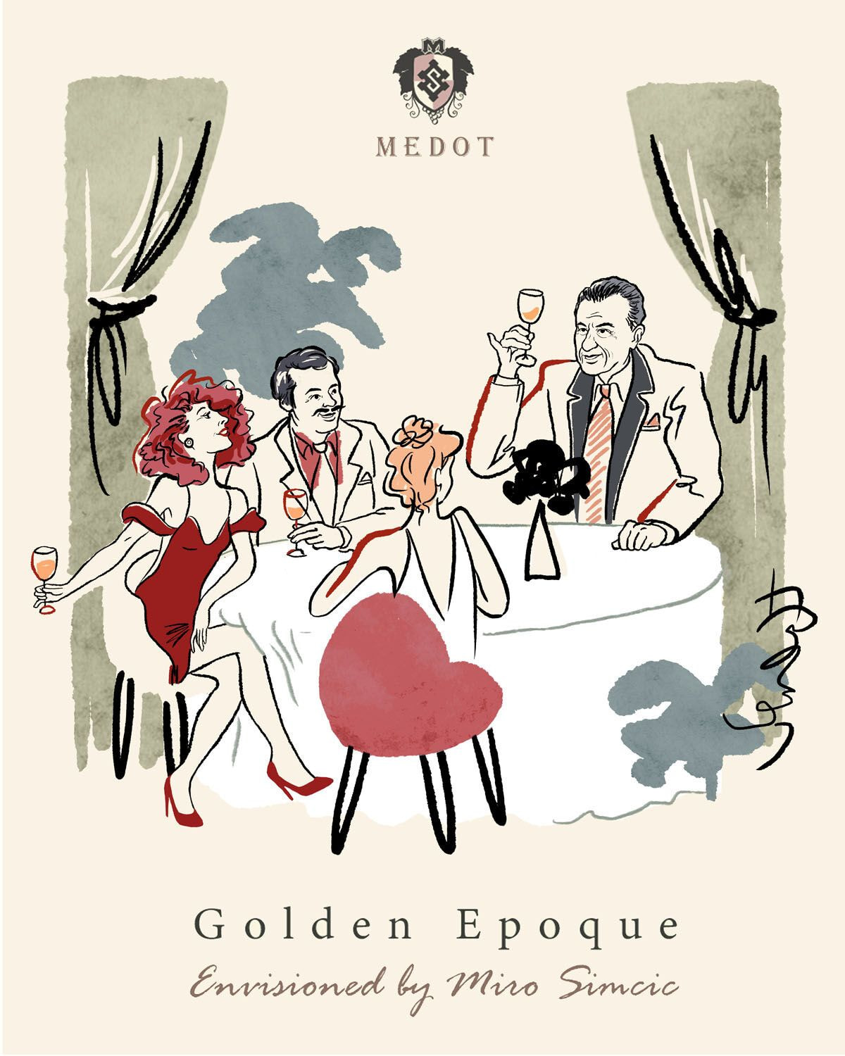
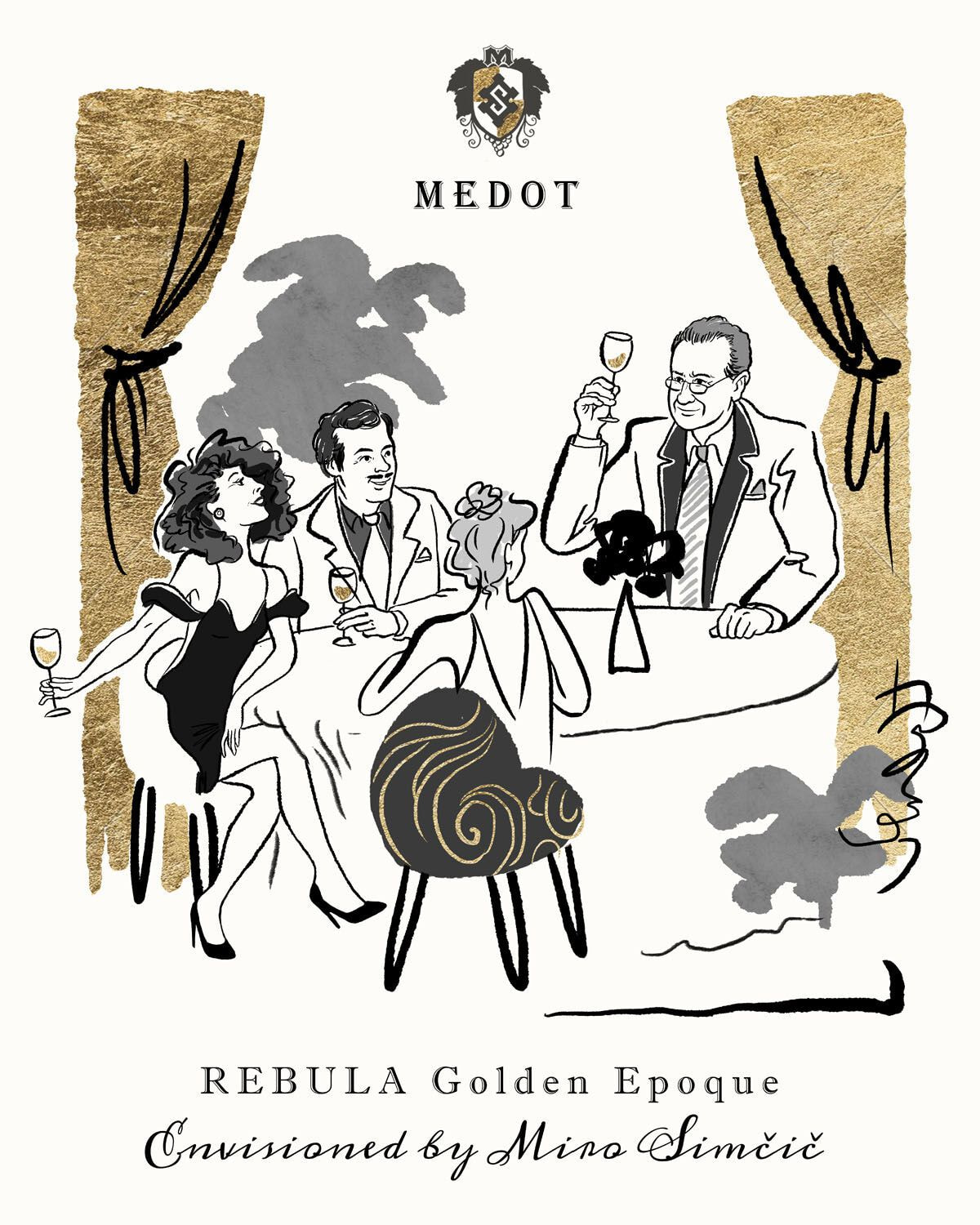
The basic story was chosen: a table, socializing, celebrating life, and golden times. The elegant and stylized illustrations with golden accents on the label emphasize the heritage and reputation of the brand, contributing to its premium character. This was followed by the refinement of numerous details such as the choice of paper, golden dots or lines, fonts, the drawing of the emblem, and the final choice of color palettes, with decisions made in combination with the color of the bottle, cap, and of course, the sister bottle of the wine Medot Rebula Journey.

Attractive design techniques, the use of symbols, photographs and illustrations on wine labels represent much more than just decoration. They are a key element that tells the story of the wine, connects customers with the brand, and creates an emotional bond. Artists who collaborate with winemakers create visual masterpieces that enrich the entire wine-drinking experience. Next time you choose a wine, pay attention to the visual message on the label – you might discover a new story that will take you on a wonderful wine journey.